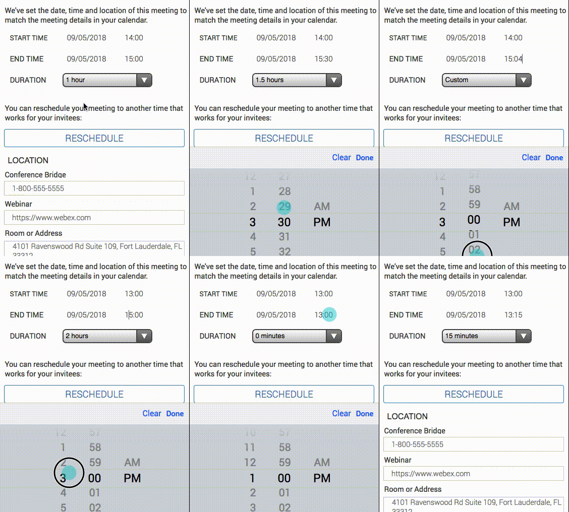
Currently, I’m a Senior User Experience Designer at Santander Bank, leading conversation design of our virtual assistant “Sandi” for the US team and UX design for the self-service value stream on web and mobile.

Currently, I’m a Senior User Experience Designer at Santander Bank, leading conversation design of our virtual assistant “Sandi” for the US team and UX design for the self-service value stream on web and mobile.

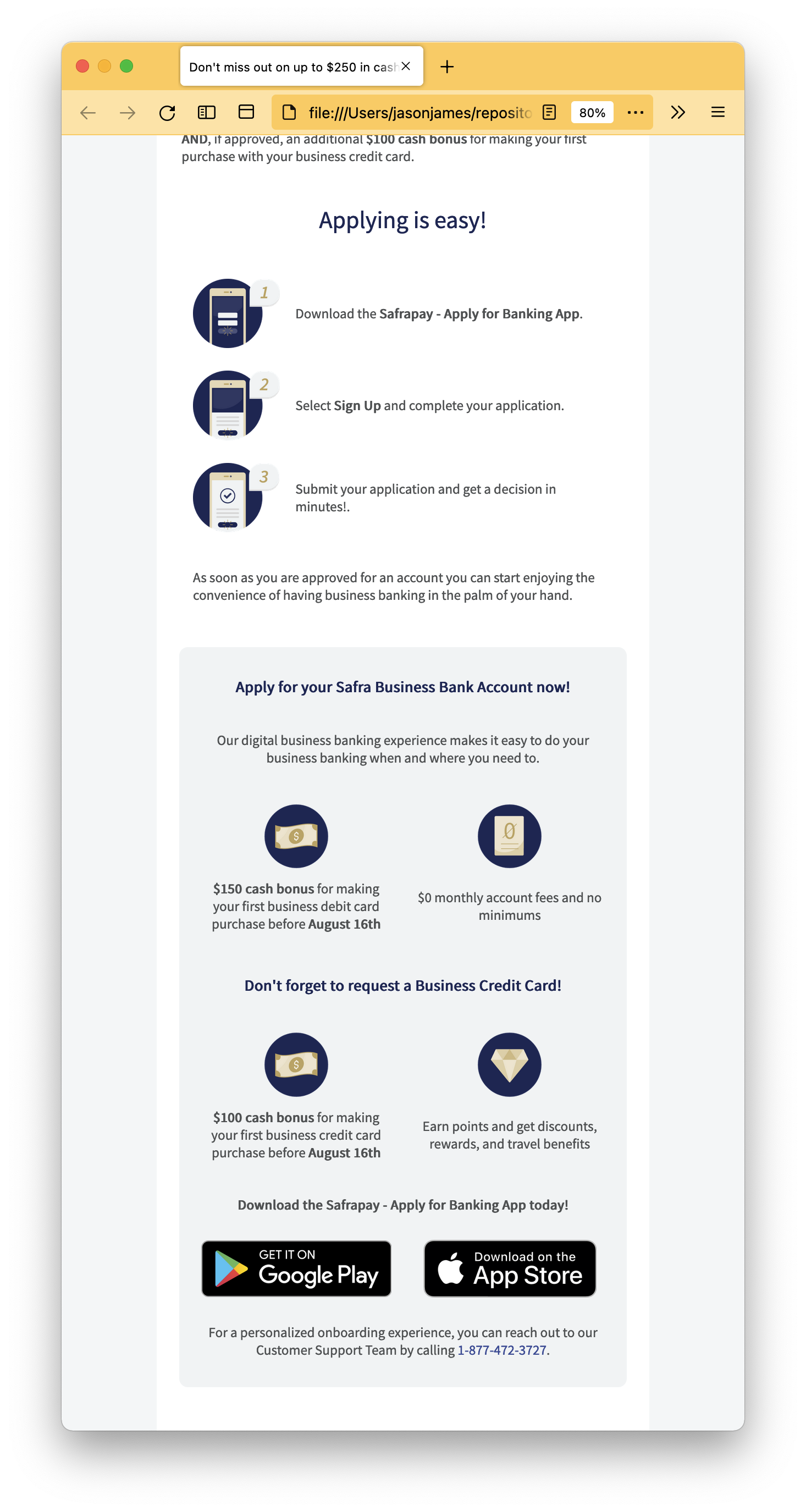
Believe it or not, sometimes we need to send styled e-mails without a fancy service.
Multiple hat wearing conversation designer/technical curator, product owner, project manager, and communications designer/developer for a fintech startup.
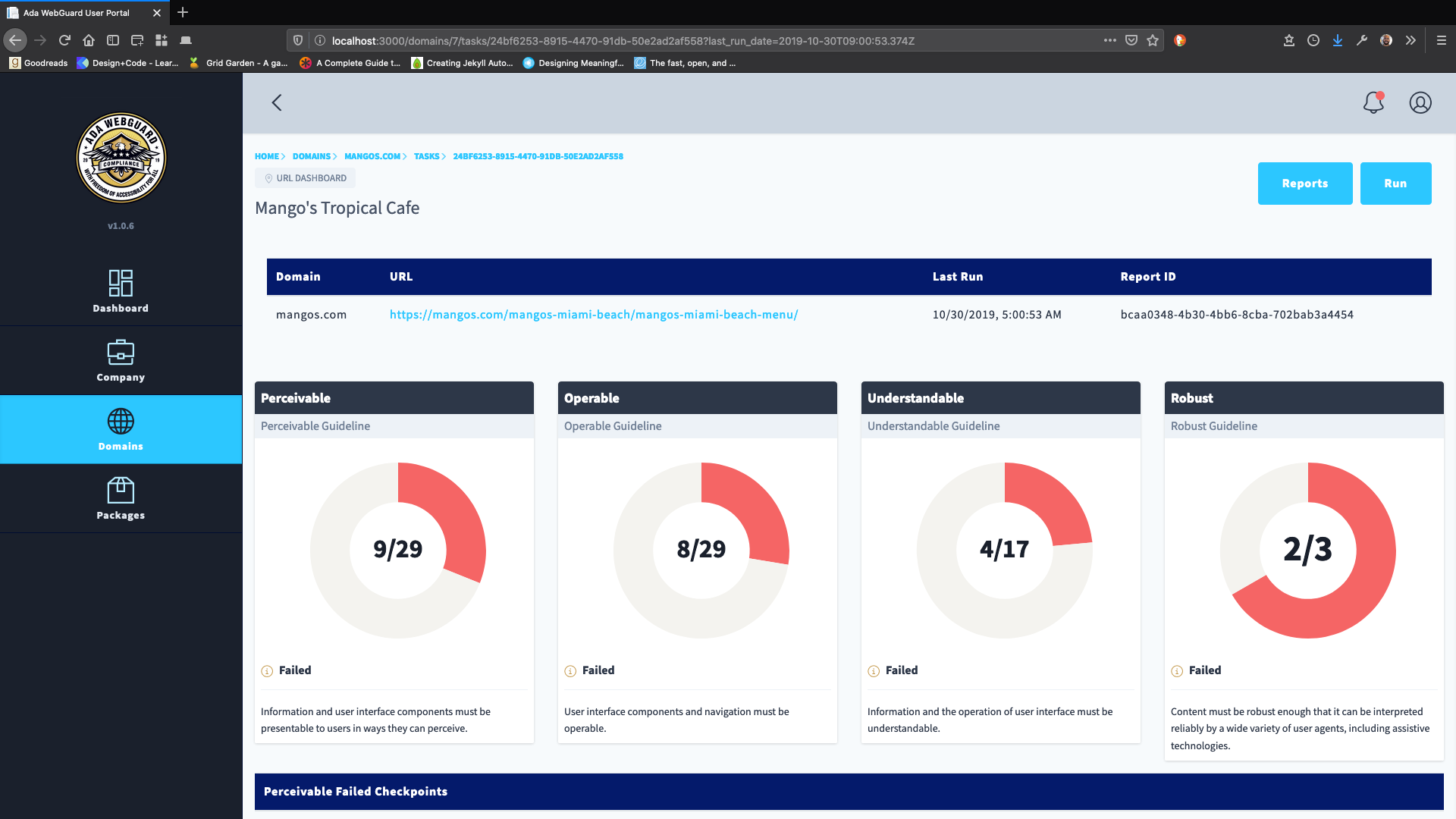
Our team took over development of a web accessibility application after a previous developer didn’t finish the project. With little documentation, we needed to fix bugs in the code, while improving the overall UX of the product. In addition, the team lead performed a usability heuristics audit of the company’s overall website, including the application’s landing page.
I joined the Recyclaide team pro bono in late 2019 to help bring the ideas they had for an app to life. Rapid prototyping with Framer X.
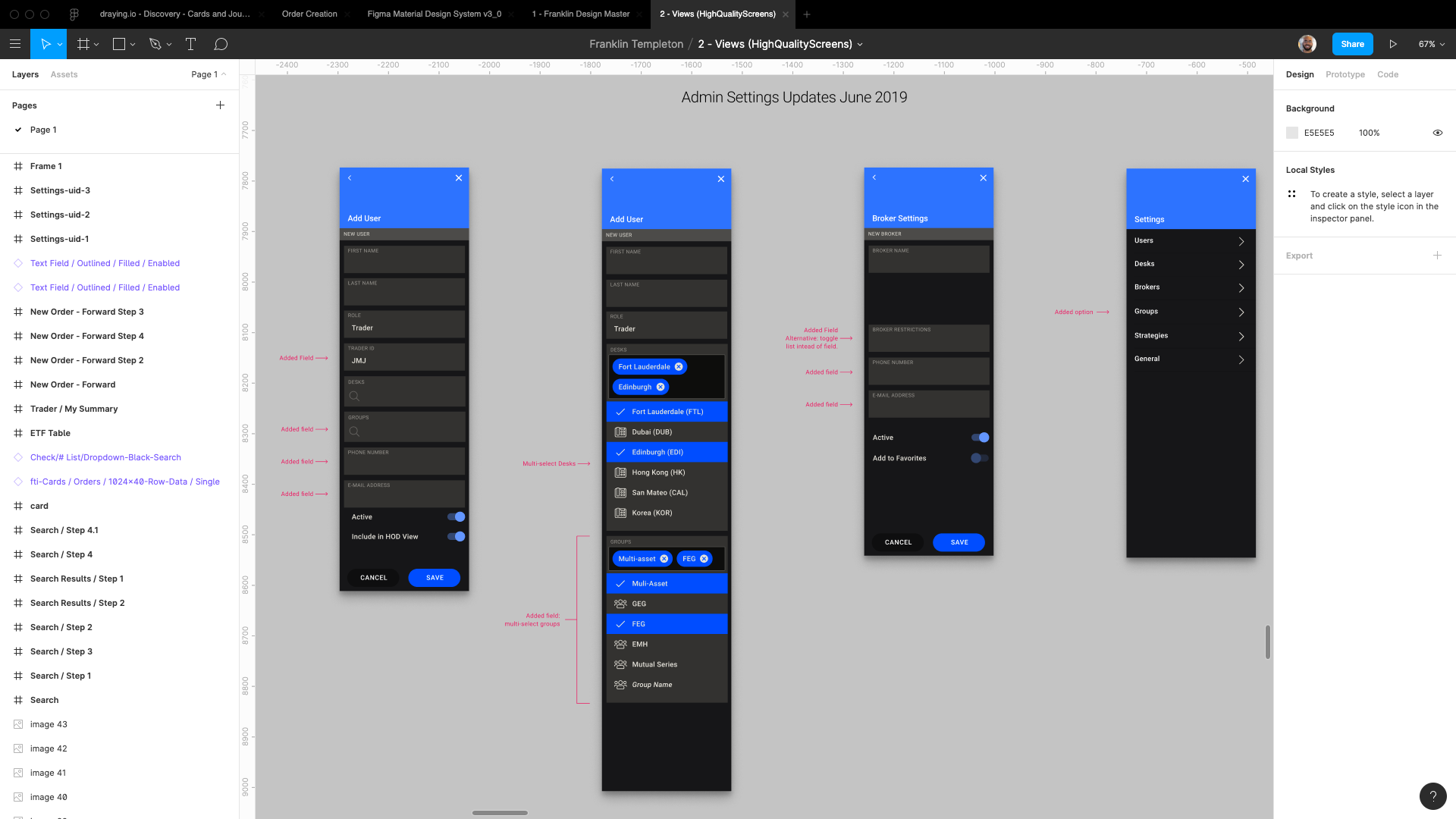
Cross.Team worked closely with a large financial institution to redefine the user experience of worldwide traders and their managers. This newly redesigned presentation layer foundation was delivered as a full design system and allowed the IT team to design, develop and quickly deploy a world-class user experience for internal end-users and stakeholders.
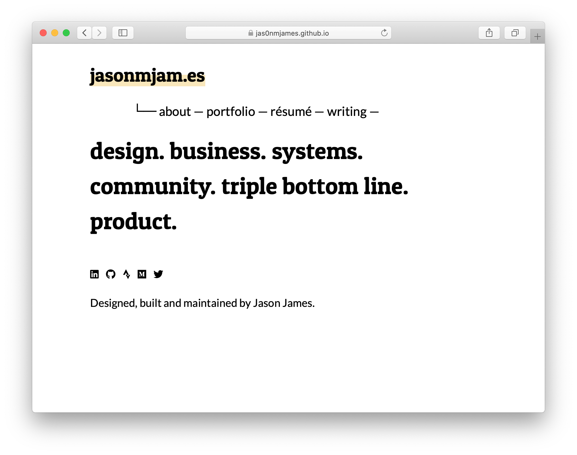
Personal and Portfolio Site written in HTML, CSS and Markdown with Jekyll. Starting from scratch (not with a template) to learn for understanding, on a journey to learn the JAMstack. Next stop, design in Framer and build in React.
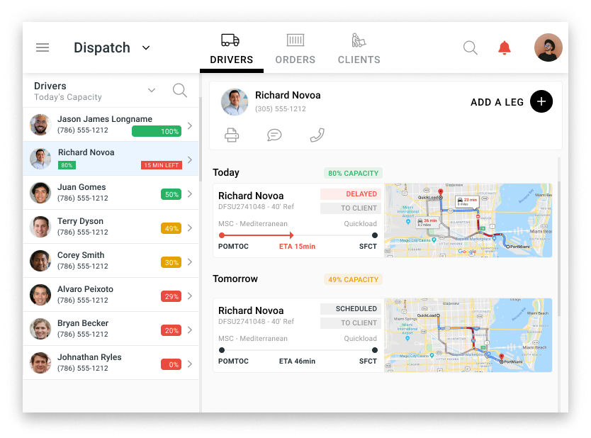
cross.team was asked to design a new front-end for a container shipping order management and dispatching application. The client was a startup in the drayage industry.
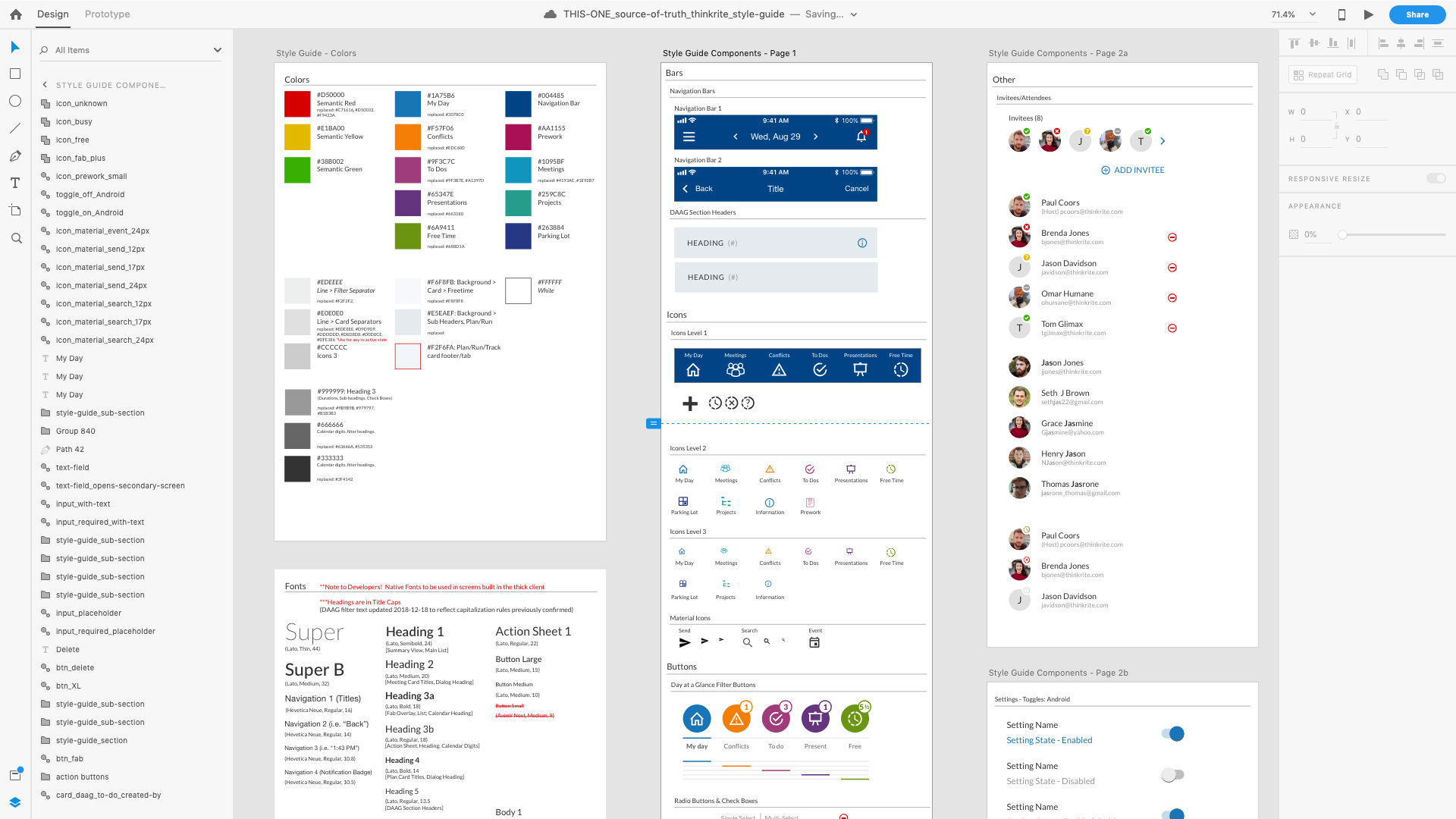
I previously wrote about building a Design System in Sketch for my own Bloombox project. Although I can’t take credit for the overall visual design here (a UI designer was on the team), I rebuilt every component within XD and created nested symbols that could accept design changes across multiple components, screens and files.
Data Visualization can be an incredibly useful tool to discover insights in user testing data and in business analysis in general. When done right, the data is plain for all to see and can help avoid lengthy, subjective arguments.
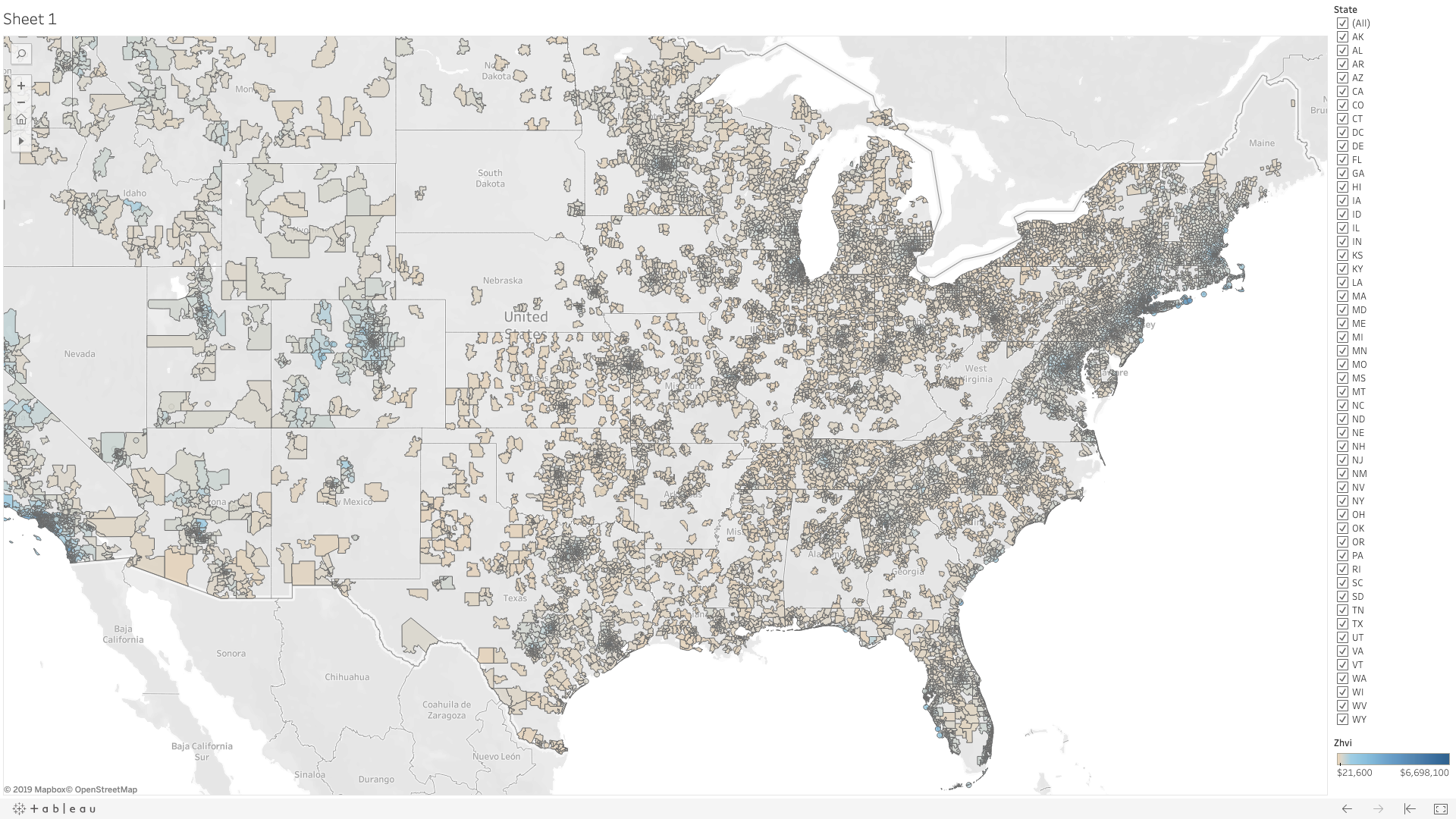
Before building products for the web, I worked with designers, engineers, superintendents and clients as a project manager, building physical products.

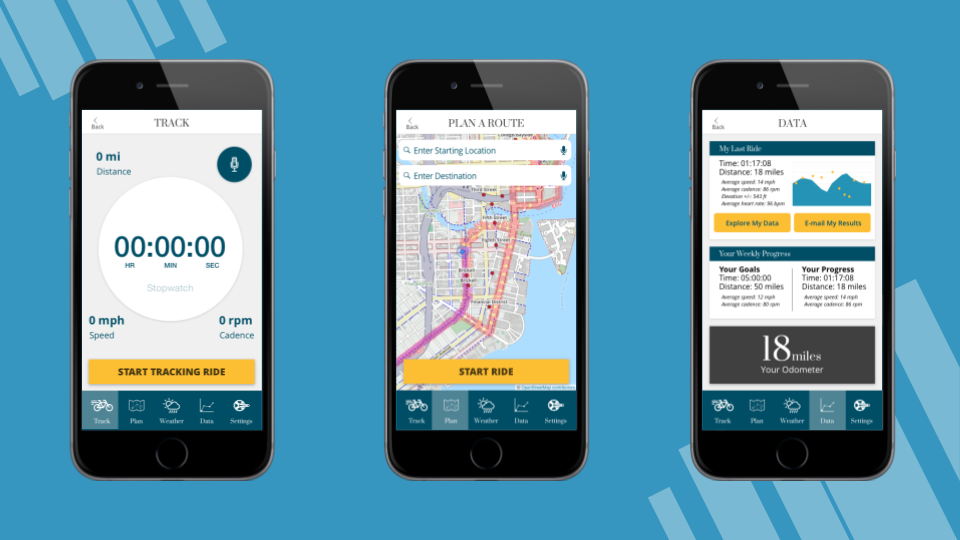
Solving user pain points by helping to cut through traffic figuratively (so many cycling and fitness platforms!) and literally.
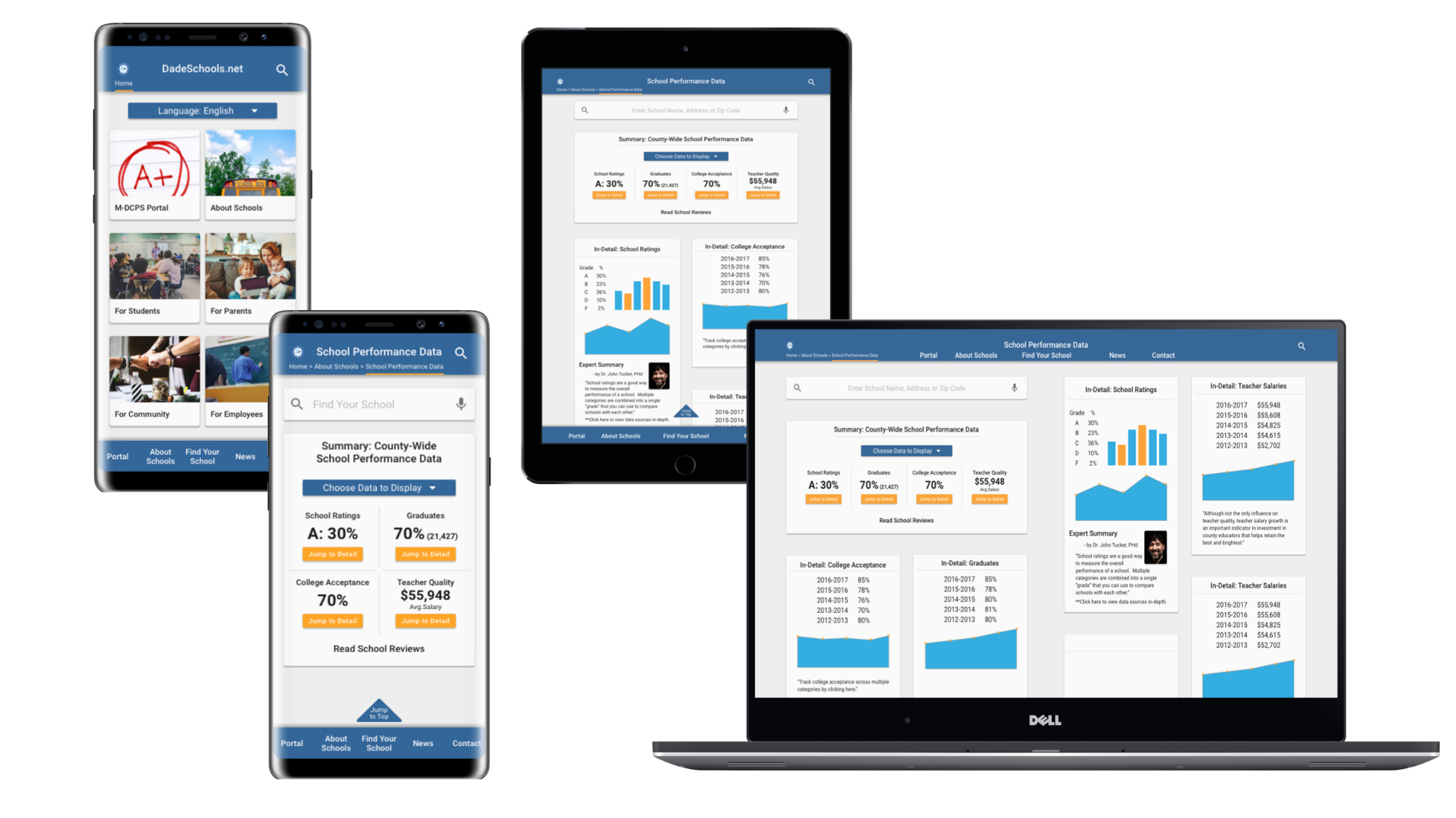
Improved the Dade Schools site’s overall information architecture to reduce cognitive overload and emphasized making school performance data more accessible to the public with a mobile-first design. The site was now built for not just school administrators, but parents and community members too!
From Design Sprint to Design System to High Fidelity Interactions
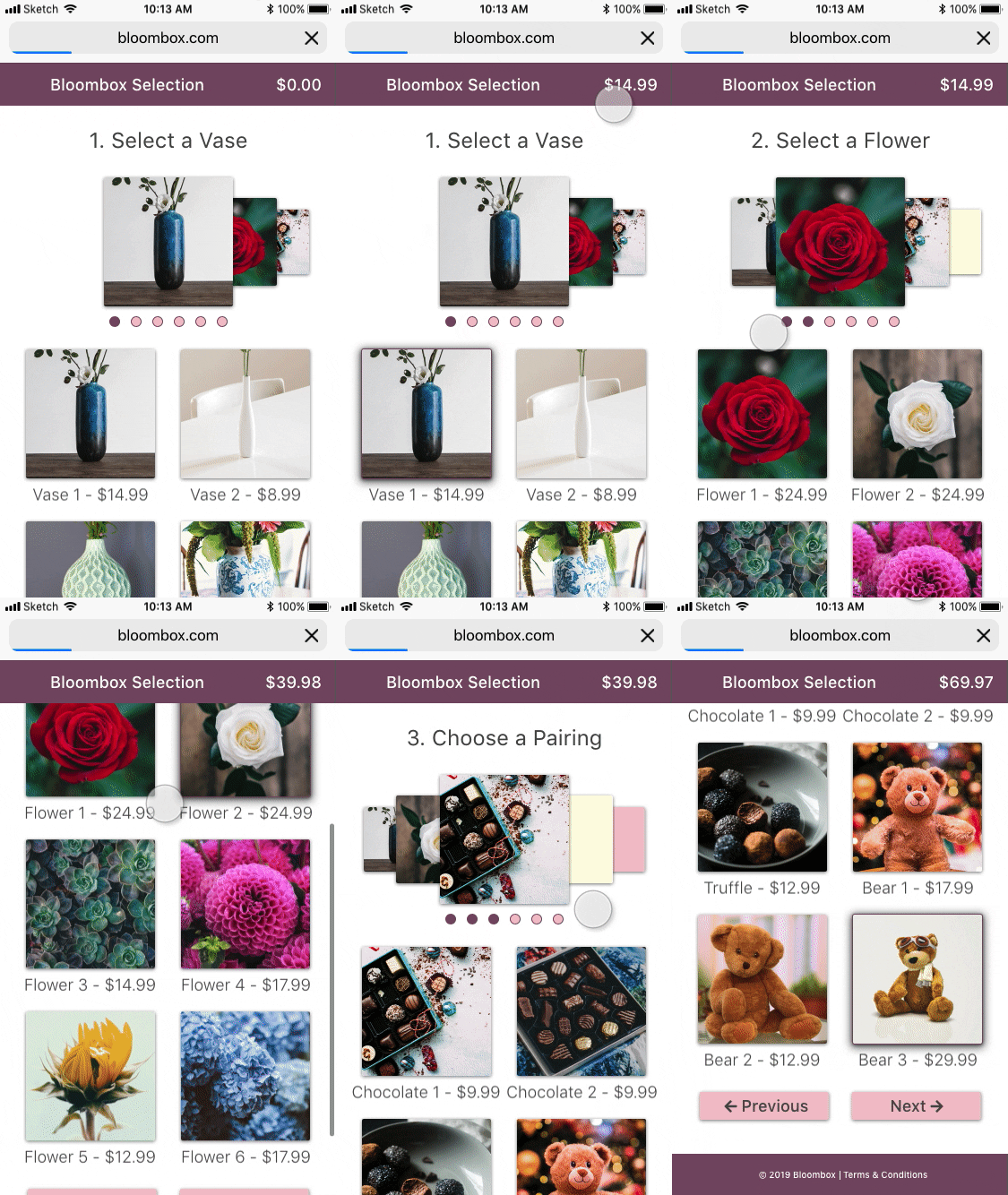
Much of my work in 2018 was under NDA and I won’t be able to walk you through the design process. However, I wanted to share with you an example of the sort of advanced prototyping I had the opportunity to put together.
