Currently, I’m a (Contract) Senior User Experience Designer at Santander Bank, leading conversation design of our virtual assistant “Sandi” for the US team and UX design for the self-service value stream on web and mobile.
Day to day, this looks like solely supporting three development teams with UX research, UX/UI design, and conversation design for web, iOS and Android.
I’m part of a small, but growing design team supporting the larger digital transformation effort for the bank’s 2 million + customers in the US. We collaborate and support each other on a weekly basis and are part of a larger global design consortium for the global bank.
Day to Day / Day in the Life
Interface Design in Figma
- Global design system -> US design system
- Mobile & Web
- Investigating APIs when appropriate
UX Expert Reviews & UX Debt Creation
Cross Functional Collaboration
- PMs, POs, Developers, QA, Legal/Compliance, Business Control, CX, Marketing/Branding
- Product Grooming
- Cross-cultural: collaborating with Global in Spain & the UK
Agile in JIRA
- Backlog management
Conversation Design & Expert Review
Organizational & Systems/Process
- Copy project
- HCST
- Moving towards more and more user flows
See projects below.
Projects
- Sandi, the Virtual Assistant: research, conversation design maintenance, improvements and additions
- Sandi, the Virtual Assistant: Entry point UI design for mobile
- Report Your Card Lost or Stolen: UX/UI design for web
- Dispute Tracking: research and UX/UI design for web and mobile
- Transaction Enrichment: research, collaboration, and UX/UI design for web and mobile.
I’ll provide more details as each project is released to production.
Performing an Initial Accessibility Audit of the Virtual Assistant
Coming Soon
- High Level Remediation Plan
- Sharing manual testing best practices with the QA team after initial automated testing (with axe DevTools) missed key accessibility violations (innaccessible buttons were divs)
- Communicating virtual assistant architecture to business stakeholders which allowed better clarity for discussing accessibility violation impacts. Creating a high level user journey to show how accessibility impacts the current experience of the Virtual Assistant.
- Performing a detailed manual accessibility review using WCAG guidelines as success criteria
- Performing detailed manual accessibility reviews using browser developer tools
- Automated accessibility reviews with free tools: WAVE chrome plugin, axe DevTools
- Communicating accessibility basics
- “Design/UI issues”, “Functional/code issues”, “Content issues”
- New EU requirements to bolster Accessibility important with our European partners.
- Various accessibility resources and basic principles
Creating an Accessibility Dashboard with Open Source Tools
Coming soon.
Copy Organization Project
- Utilizing confluence macros and page labels to create a repository with the tools available
- Defining the intake process
Transaction Enrichment: Giving Clarity to Customers about their Transactions
Feature not yet deployed to production.
Dispute Tracking: Research and UX/UI Design for Web and Mobile
Feature not yet deployed to production.
I’m particularly excited to show you how I adapted components in the existing global design system for the US design context and specific project needs.
Stay tuned!
Report Your Card Lost or Stolen: UX/UI Design for Web
Feature not yet deployed to production.
Coming soon!
Virtual Assistant Entry Point UI Design for Mobile
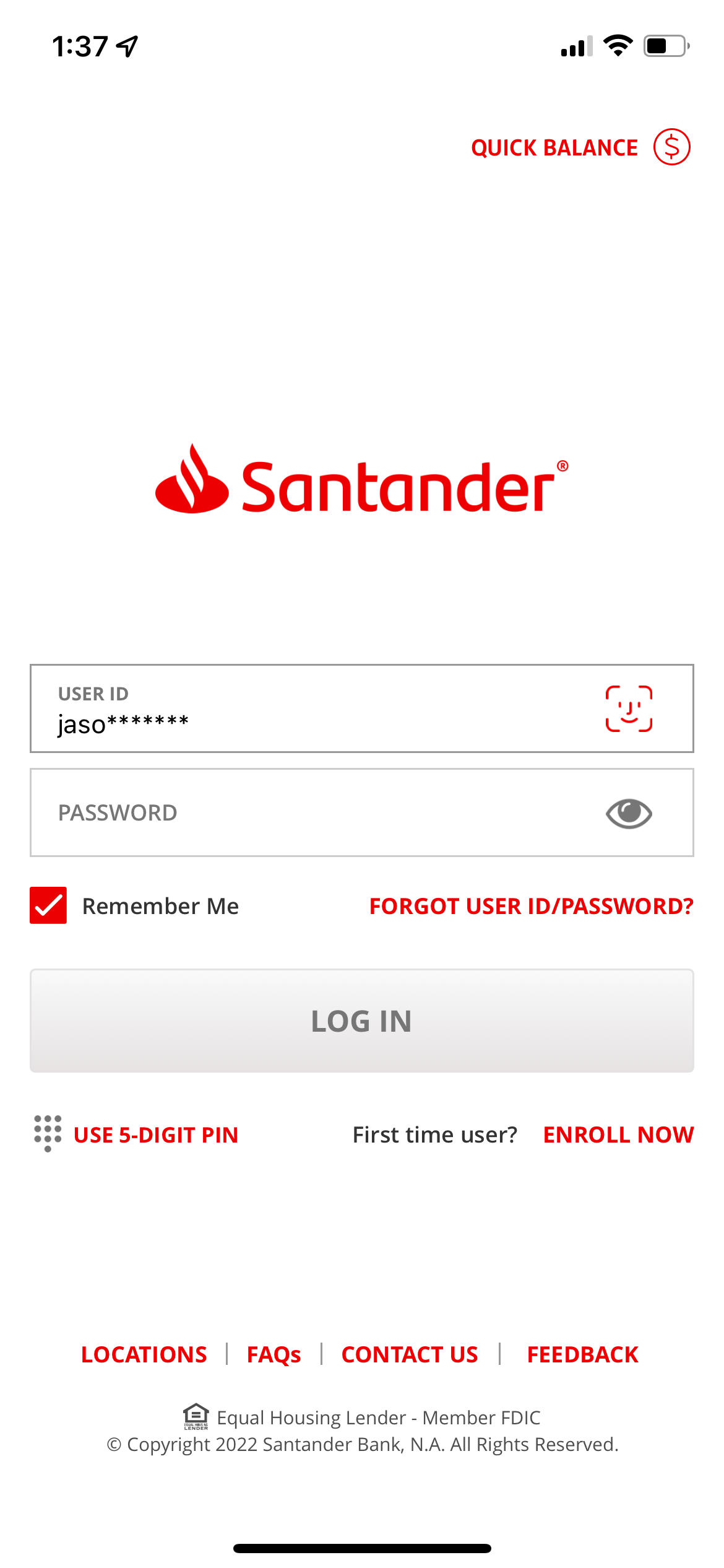
The screenshots below are taken from the production iOS application.
A key win for the user experience in this project was not placing an entry point for Sandi, our Virtual Assistant, on the login screen, which was already filled with a call-to-action and several secondary buttons.
With the support of the Head of UX and using supporting secondary market research and my analysis of user utterances in Sandi (inputted user text), I worked with developers, the product owner, and the product manager, to not add an unneeded entry point.
Sometimes the biggest UX outcomes are about what doesn’t show up in the UI.
Login


Contact Us, Overlay
Contact Us

Account Overview Entry Point

Sandi Opened

Creating Design System UI Components for Sandi
With Figma’s Auto Layout, Components and Variants, I created UI components for our design system that are adaptable for a variety of design needs:
- Components that automatically resize horizontally to accommodate mocked text
- Components that automatically resize vertically to accommodate longer strings of mocked text
- Placing components within variants that have multiple properties to accommodate theming. For example, the same component might be vertically growing and light themed, with a variant that is horizontally growing and dark themed.
Feel free to explore below how these components are put together.
I’m hosting the components below in a personal Figma instance for security: