This page was last updated on February 16, 2020.
Introduction
Project Overview
Our team took over development of a web accessibility application after a previous front-end developer left the project. With little documentation, we needed to fix bugs in the code, while improving the overall UX of the product. In addition, the team lead performed a usability heuristics audit of the company’s overall website, including the application’s landing page.
Project Duration
Two Weeks
My Role
I performed usability heuristics, worked with the developer to identify and resolve bugs in the code, and worked with the stakeholders in a project management capacity to prioritize needs in the short time frame available.
Assessing the Site
My colleague and cross.team director Marcelo initially performed a usability heuristic and competitive analysis of the company’s main site, which would be the landing page for - but did not include - the application:
The Existing Site
Screenshots of the existing site helped place the immediate effort in larger context.
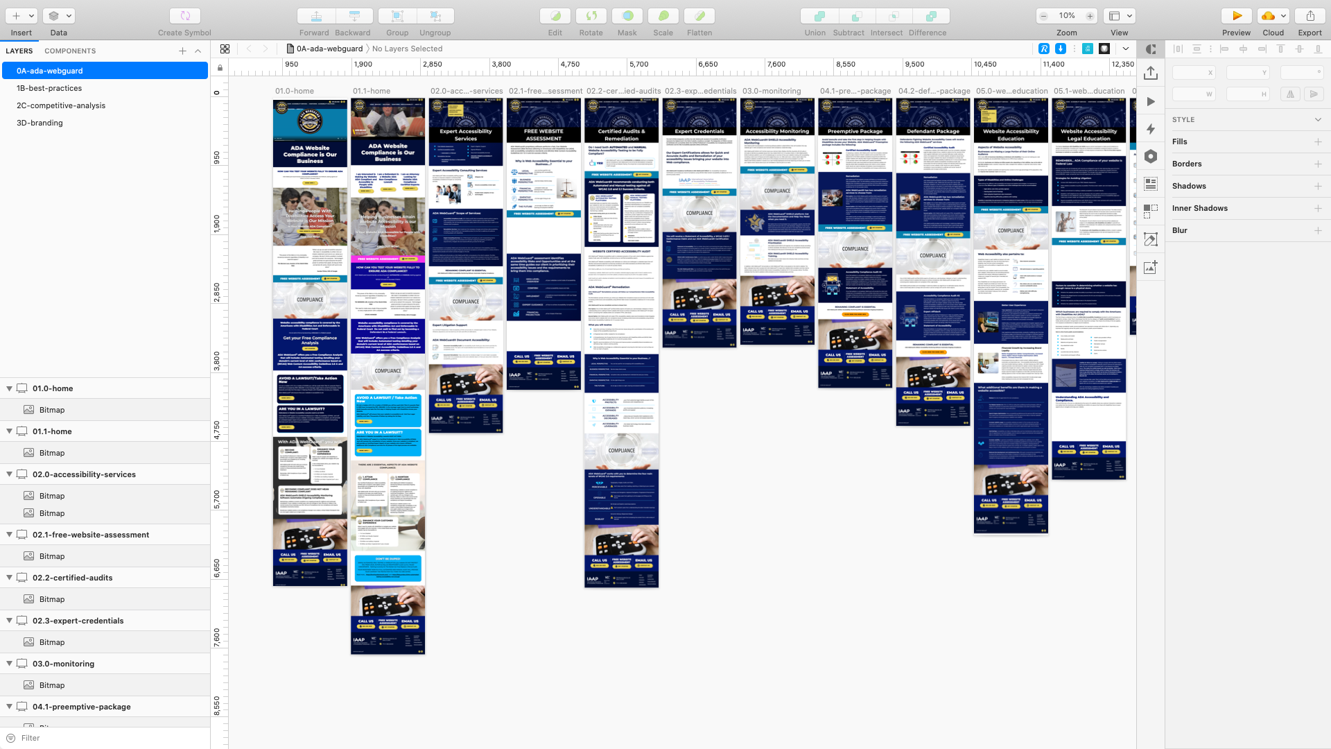
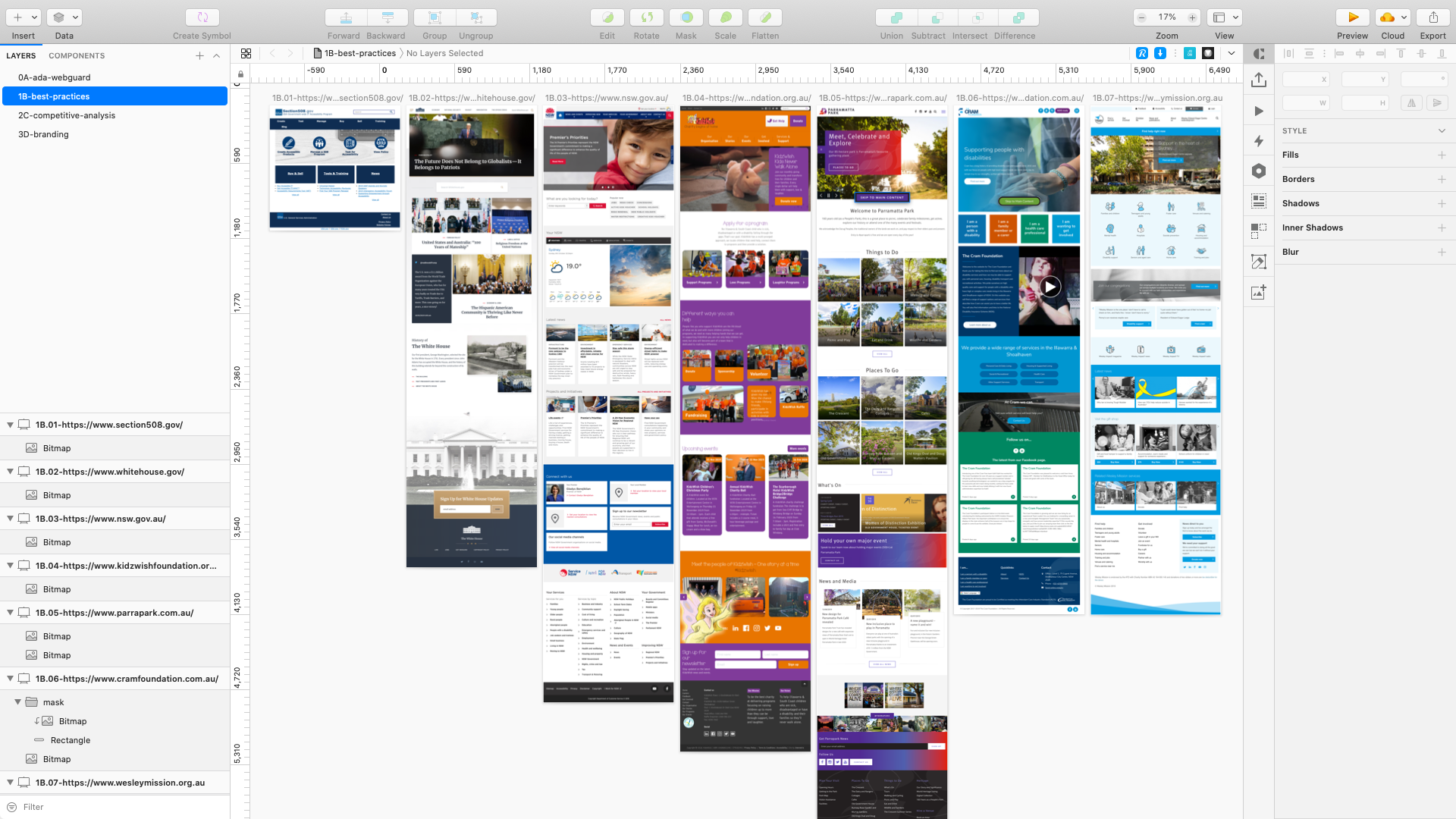
Assessing Best Practices in the Accessibility Landscape
Examples of best practices in the larger accessibility space helped larger discussions of the product’s aims and business model.
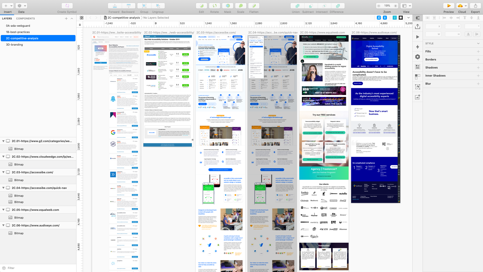
Assessing Competitors
Examples of direct competitors helped clarify the direction of existing and proposed features.
Assessing the Application
With the larger context for the project laid out, it was time to assess the application itself.
The client wanted to deploy an MVP (Minimum Viable Product) of the application within two weeks of cross.team joining the project. The goals were to:
- Fix known front-end (html/css) bugs and identify unknown front-end bugs.
- Fix known usability issues and identify larger usability issues.
- Work with the backend team as needed to resolve API issues.
- Work with CTO and Stakeholders to prioritize what code and usability issues could/should be fixed within the two week window to get the product ‘MVP Ready’.
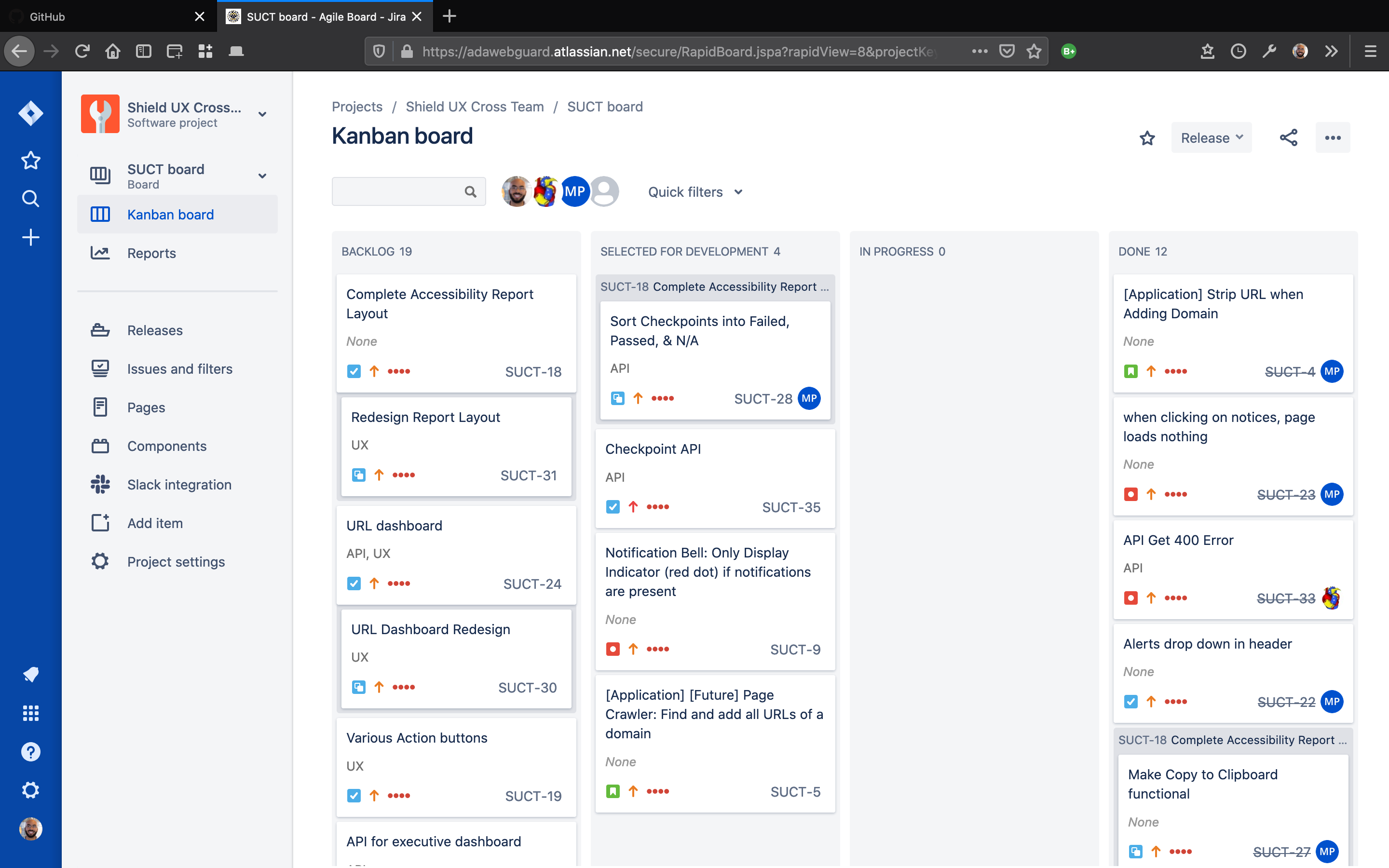
JIRA
I worked with the CTO and my colleagues to create JIRA tickets to track issues:
Identifying Low Hanging Fruit
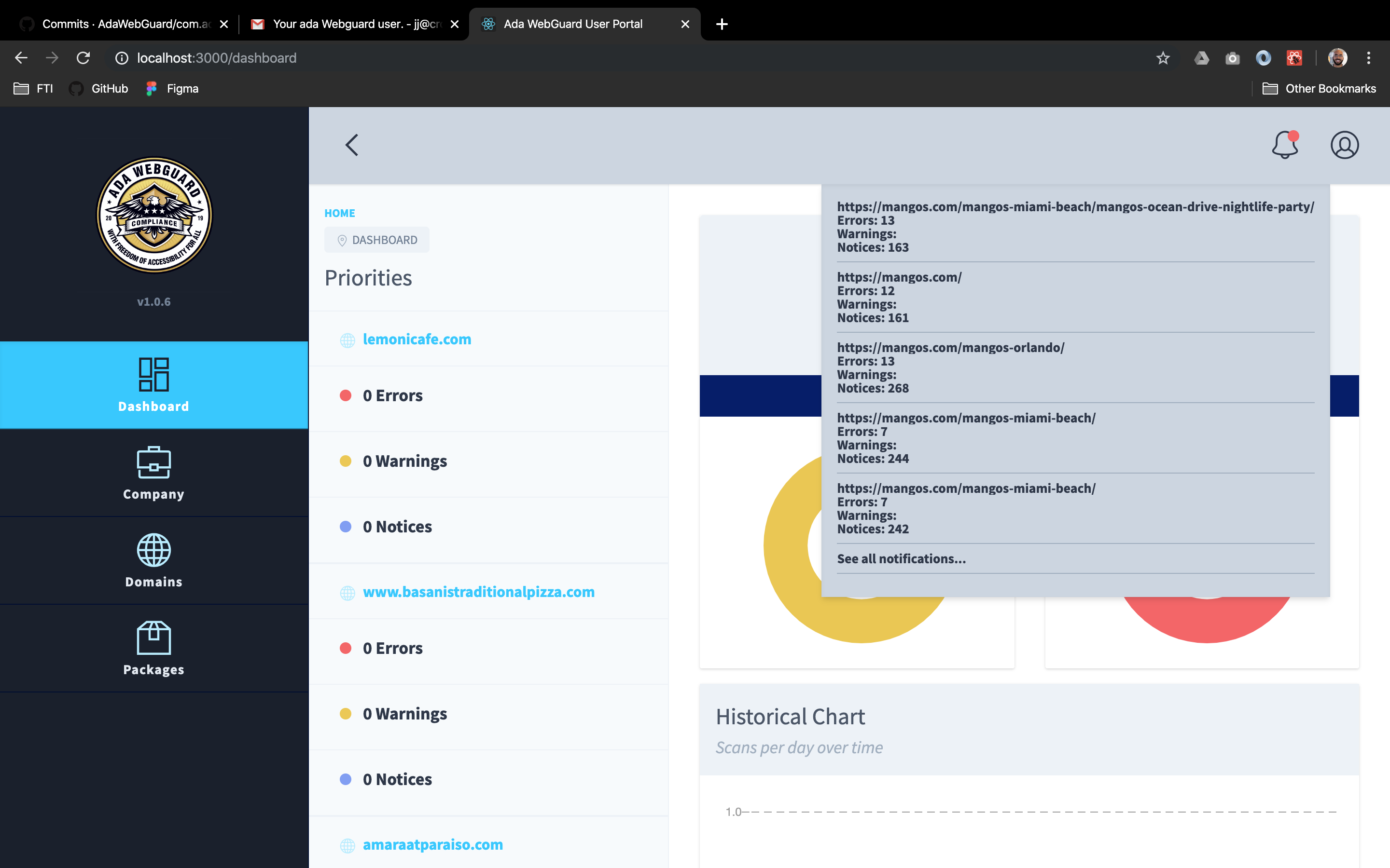
Through the prioritization process, we identified issues that we were confident could be fixed within the two-week timeframe and that were important to the MVP. For example, my colleague Marcello worked with the backend developer to fix the data integration for notifications (previously, notifications were not being displayed properly):
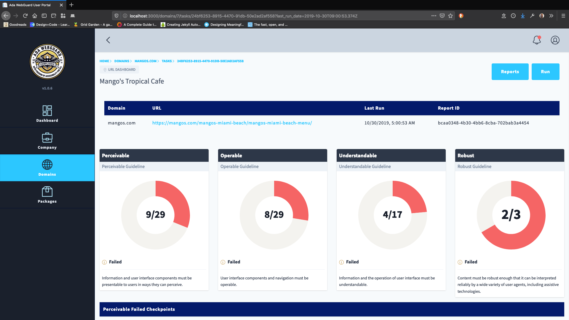
Or, in another example, we identified that the Information Architecture (IA) of the product could be improved in several ways. In the example below, I suggested simplifying a page’s breadcrumbs. Here’s the breadcrumbs with the page heading and subheading:
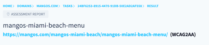
My suggestions:
- Remove the report ID (“24BF62…”) from the breadcrumbs
- Remove ‘tasks’ from the breadcrumbs
- Move the page’s tag - in this case ‘assessment report’ - below the page heading to help with visual hierarchy
- Change the font weight and color of subheadings to help distinguish visual hierarchy
Inspecting the Application UI
As there was little documentation, I worked with my developer colleague to understand the front-end architecture of the application and to assess the best way to update the entire UI to a more modern look and feel.
Through my browser’s developer tools and by accessing the application’s repository, I was able to determine the previous developer utilized tailwindcss:
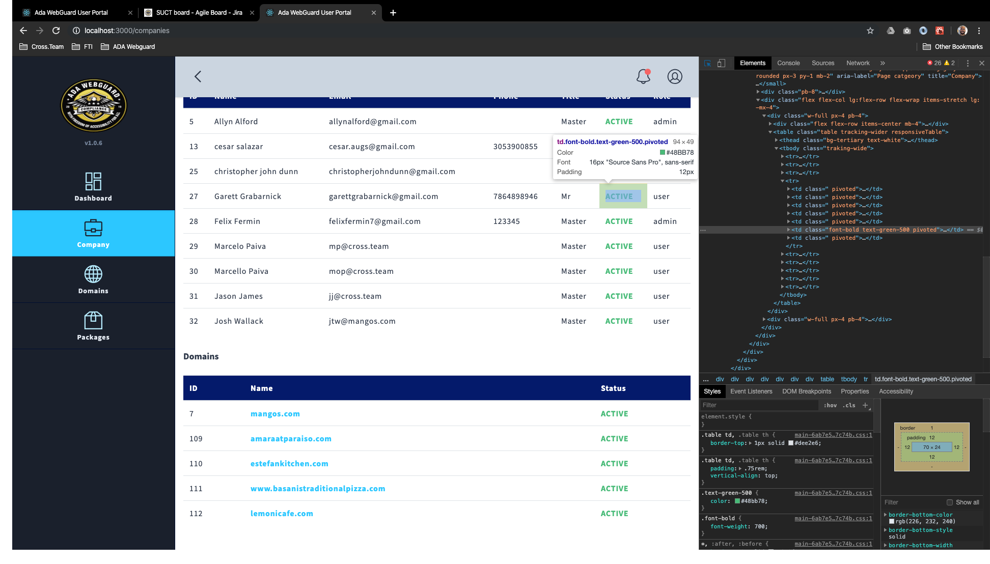
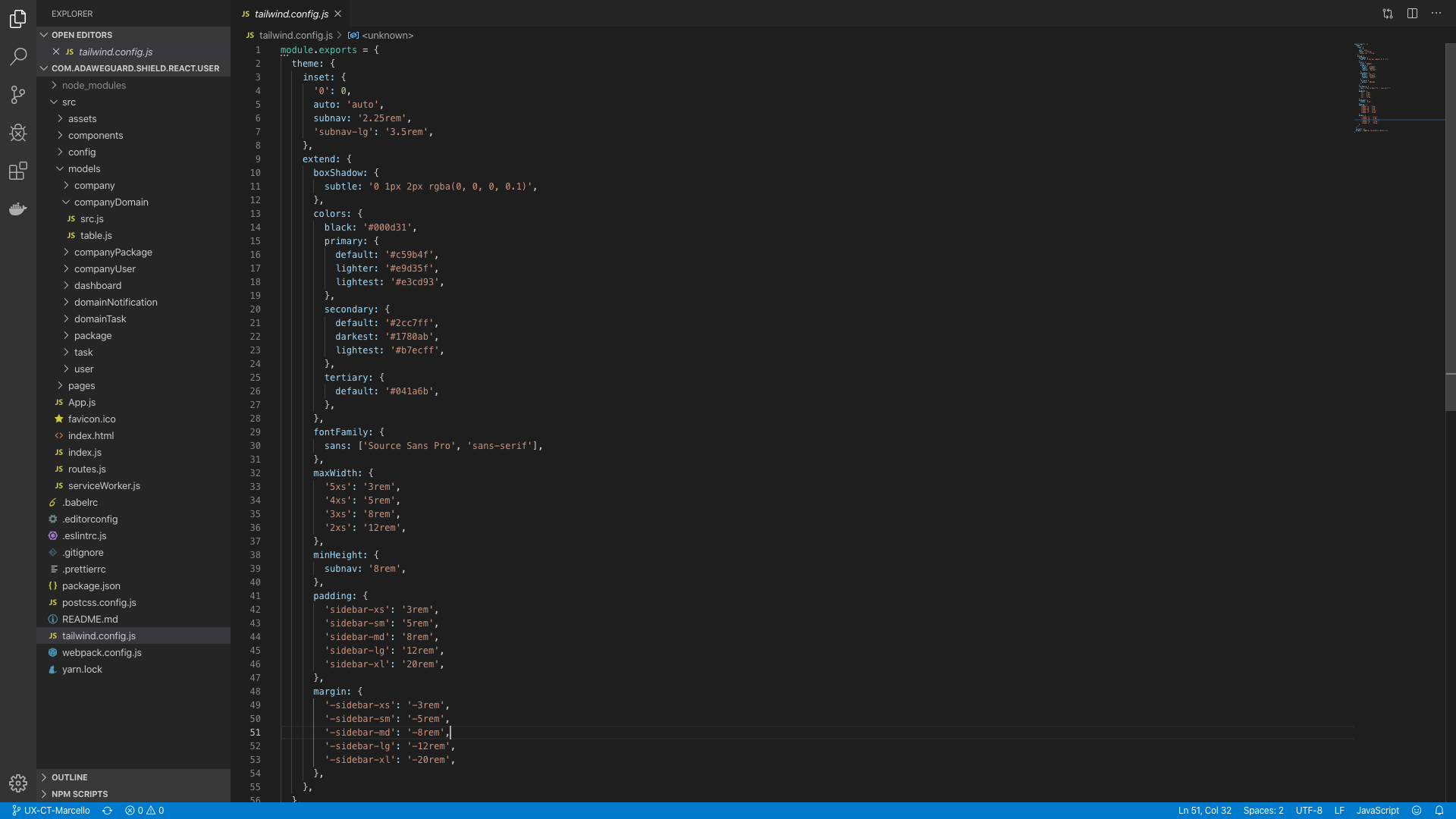
Unfortunately, a componentized approach was not used by the previous developer when building the site, which meant changing styles across the application would mean changing them on each individual template page.
Identifying Harder to Reach ‘Fruit’
Many issues identified in the usability review were related to incomplete features that needed input from the stakeholders before they could be finalized. For example, the logic in arguably the product’s main feature - an assessment report on a specific website domain - was not yet complete:
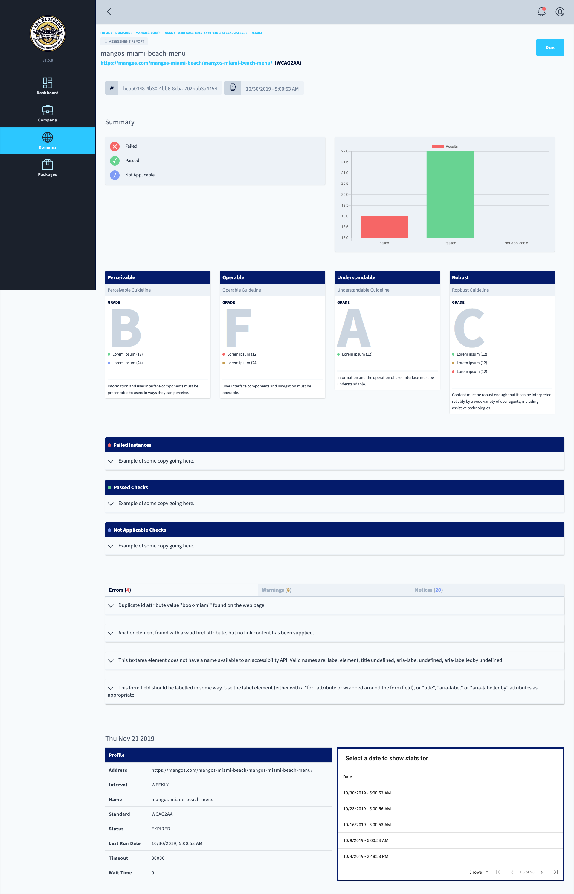
In the case above, the report was not fully populated because of the incomplete logic.
Because of our client’s personnel turnover, the intent of these incomplete features were not fully documented and I worked with the client to help clarify what the intent of the features might have been based on the best practice and competitive analysis noted above.
We created a backlog of issues and usability suggestions that we were unable to get to in the two-week time period.
Next Steps
Ultimately, we were able to fix the high priority bugs in the code and identified a path toward improving the overall usability of the site over the short, two-week duration for our role in the project.
Following this effort, next steps would involve designing a more modern look and feel (UI) for the application while incorporating the usability improvements we identified.
Conclusion
This case study was written to show how as a team we were able to quickly solve a businesses needs within tight time constraints and little documentation.